
What is Shiny, and why use it?
One of the most exciting aspects of our work at Education Analytics is bringing data to life for our partners. As many who work with data know, making data intuitive for those who are unfamiliar with data analysis can be a challenge. Every project we work on is different, and we want our analyses to fit each partner’s unique needs. We use a variety of methods to present results, including data visualizations, written memos, PowerPoint slides, and interactive displays.
One type of these displays is a Shiny dashboard created in the R software environment. This is an accessible, quick, and personalized tool we share with partners—and use internally. Shiny apps allow partners to take their data into their own hands and use those data to answer their specific questions. They are particularly advantageous for the field of education, as they allow our partners to view multiple student subgroups of interest, by comparing, contrasting, and filtering as needed.
Imagine that a stakeholder in a project wants to compare different cut-points for creating groups of students (such as low, medium, or high risk) for a new metric, and they want to explore how those options impact each group of students. This metric could be anything that separates the results of an analysis into different groups, such as a measure of students’ on-track status towards postsecondary success or a measure of school performance for a district to assess their schools. The stakeholder’s goal is to clearly see the impacts of their cut-point choice for all possible combinations of students in order to make a decision informed by real data. To assist the stakeholder, we could provide a written memo or white paper, an HTML report with static plots, or a spreadsheet with the necessary data. All of those potential options could be the best solution in a certain scenario, but they all face a couple key challenges to making data interpretable and accessible.
What are some challenges to reporting data?
The first challenge with these types of reports is that it can be hard to engage the stakeholder in the process. Our partners value being able to see and explore their data in many ways—the ability to “slice and dice” is a common request we receive. Depending on the use case, a static report or white paper could lead to the partner becoming disengaged, or needing to ask many follow up questions that require additional time (and future reports) to resolve. One might think that it could be better to provide a spreadsheet, so the partner could create aggregations and plots themselves, but this shifts a lot of the burden onto the stakeholder. It also removes safeguards of the data being in your control—meaning that data could be accidentally aggregated in unexpected ways and could lead to misleading results.
The second drawback is that it can be overwhelming for a user to try to interpret static visuals showing all of the possible combinations of how each metric choice affects the results. For example, imagine that a stakeholder working in a district serving students in grades Kindergarten through 8 wants to see how the results of two cut-point options affect:
- students with and without disabilities
- students of different genders
- English learners and non-English learners
- students in each grade
This would create 30 different plots (15 student groups x 2 cut-point options)—and that is without considering cross-sections of those groups (such as female students with disabilities in 8th
grade). When a report contains that many plots, it can become easy to get overwhelmed and to miss key takeaways that could inform the decision.
Why is Shiny different?
In this scenario, instead of using any of those static solutions, we would instead build a Shiny app that empowers our partners to explore their data themselves via reactive plots that can visualize every possible combination of data. There are many features of Shiny that make this possible, but here we highlight two very basic features that are simple to implement in code: reactivity and the ability to export reports and tables.
Feature 1: Reactivity
Reactivity is the key to Shiny. It allows for users to actively explore their data by choosing in real time what they would like to see. This is the key difference between static reports and Shiny. The transient nature of plots in Shiny allows many more combinations to be seen and digested than the permanent plots of a report.
In more technical terms, reactivity is what allows the UI (user interface) to change based on a user's choice. To demonstrate this, let’s return to the scenario above, where a stakeholder needs to decide what cut-points to select on a new metric. Imagine that this stakeholder wants to compare the levels that students are placed into by grade, race/ethnicity, and economic disadvantage status.
A relatively simple application of reactivity is to use it to automatically update a plot when a user selects a new demographic.
A more sophisticated application would be to use it to change the features of the visualization itself based on what a user is inputting—meaning some features (or views) appear when certain metrics are chosen and disappear when other metrics are chosen. For example, if we allow users to choose two categories of demographics to compare, we want the possible list of demographics for the second input to change based on what is chosen in the first input. If a user chooses “Race/Ethnicity” as their first input, we want the second input to change potential values so that they cannot choose “Race/Ethnicity” again.
Shiny makes this possible by providing a functionalized variable to subset and filter the data. We can create a dropdown input for the user so they can choose the demographics to look at, which would look something like this:
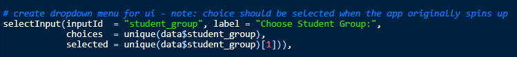
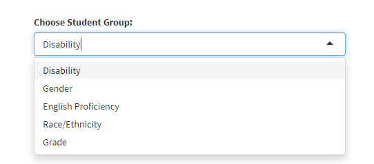
In this code, we are creating an input selector so that a user sees a label of “Choose Student Group:” and can select any of the subgroups in the data from a dropdown menu. So that the visuals are created right away when the page loads, we select one of the subgroups to start with by just grabbing the first student group that appears in the data. The result of this code might look something like this:
Then, in the server (meaning where we create the outputs for our app), we can create a dataset that reacts to this input. When you want to modify a dataset based on an interactive input that will change with a user’s choices, you need to do so inside of a "reactive()" call, which means that it is responsive to what happens in the app and will be re-executed whenever an input changes.
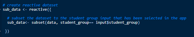
You would then feed this dataset into whatever visuals or tables you want to show to the user. This means we can show a vast variety of student groups without ever having to specifically mention or code any of them, which allows for clean and understandable code.
It also allows for a streamlined and uncluttered UI, where only a few plots show at a time, but you can view many plots over time (compared to a static report where all 30+ plots are printed on the same page). As with any visual medium, there are still limits to how many student groups you can display at a time on one plot, due to the constraints of 2D visuals.
This process of choosing what student groups and potentially even what visuals you want to see allows for the user to become invested in the process and lets them answer their own questions. This can lead to faster iteration in the decision-making process, ultimately leading to more timely and informed decisions.
Here are some of our favorite resources for learning how reactivity works:
Feature 2: Exporting Results
Now, let’s say that the user has explored the visuals enough that they have a preliminary decision, but they need a summary of the plots to convince their team. Perhaps they can’t remember what steps they previously took when they want to re-create it in Shiny, or they want to share the visuals with someone who doesn’t have access to it. This is where being able to export results is key. Shiny can be fleeting, as the output doesn’t persist when you come back to it or if you change inputs. This can make sharing your insights difficult if you do not build the Shiny in ways to allow the data to leave.
Similar to reactivity, there are simple and more complex ways to do this. If a data analyst or researcher just wants the relevant data to work with, you can build an action button that allows the download of a data into a flat file like a .csv (see the code for this below). A more complex application would be creating a pre-built custom R Markdown document that will render based on their inputs at the time of download (see an example of this in the Human Capital Analytics demo dashboard linked below).
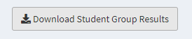
The code for this can be very simple. In the UI, you add a download button for your user and label it so they clearly recognize that they can click and receive a download. The code looks like this:

And the result in the Shiny looks like this:
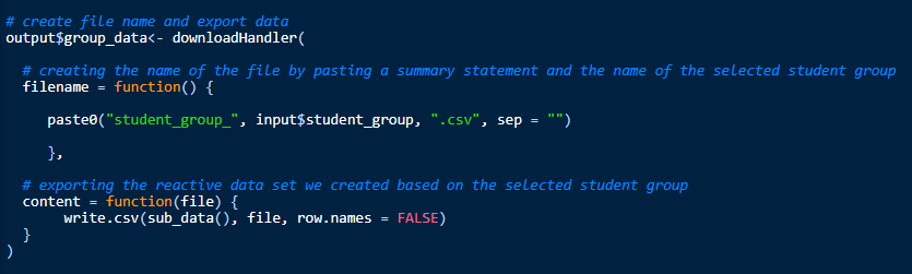
In the server, we would write code to allow for the download of a flat file based on the chosen demographic group, with code like this:
We could also export the plots that get created themselves. This makes the results more durable and allows the data to be shared on other platforms or with users who don’t have access to Shiny.
However, this solution wouldn’t allow another analyst to rebuild the exact plots or access the exact code to reproduce those plots themselves. For that, a newer package called Shinymeta can solve that problem.
Here are some of our favorite resources for learning more about downloading results in Shiny:
Where can we go with Shiny?
Shiny dashboards add immense benefits to our work with our partners. But it’s also improved how we work with data ourselves. EA has created several Shiny apps to conduct internal quality control, to create data inventories, and to summarize model diagnostics. We’ve also expanded to using other reactive display tools, like Looker dashboards and personalized web applications, especially when displaying student-level data. We continue to explore improvements to Shiny through new packages like bslib, which allows for custom theming and further personalization. By allowing for reactivity and data exporting, Shiny apps are an excellent tool for programmers and education stakeholders alike to easily access and engage with their data. We are excited to continue our work with these dashboards and look forward to the world of data they can open up for our current and future partners.